 Itemlume
PRACTICAL ANSWER / Logo studio
Why does my logo disappear when used as a browser favicon?
A favicon is not a miniature header logo. At 16 pixels, an eight-letter wordmark loses letter shapes, spacing and contrast. Use a simplified favicon-specific symbol, test its silhouette at actual tab sizes, and export transparent light and dark versions without changing the approved master mark.
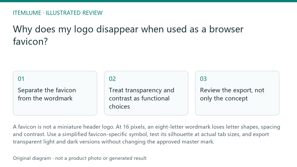
Separate the favicon from the wordmark
A browser tab gives a logo very little usable area. An eight-letter wordmark may remain recognizable in a header but collapse into a dark line or an indistinct block when reduced to 16 pixels. Fine counters, thin strokes, taglines and tight letter spacing are especially vulnerable.
Create a favicon graphic from the brand’s strongest small-scale cue: a first letter, monogram, geometric feature or compact symbol. This is a responsive brand asset, not permission to redraw the master logo casually. Record which shapes, colors and proportions must remain consistent with the main identity.
- View the proposed favicon at 16, 32 and 48 pixels without zooming the browser page.
- Compare its silhouette with the approved logo and identify the one cue that survives reduction.
- Remove text, narrow details and decorative edges that merge at tab size.
- Check the result on a light tab, a dark tab and a busy browser interface.
- Stop when the mark needs a tooltip or surrounding explanation to be recognized; simplify the symbol or revisit the selected cue.
Treat transparency and contrast as functional choices
A transparent favicon can disappear when its pale symbol meets a pale browser tab, or when a dark symbol is placed against a dark interface. A white box may create the opposite problem by making the mark visible but visually unrelated to the tab environment. Review the foreground and empty areas separately.
Prepare the favicon as a deliberately tested asset rather than assuming one color works everywhere. A light-background version and a dark-background version may use different foreground colors while keeping the same silhouette and proportions. This is user workflow advice; Itemlume planning can help organize the asset brief, but it does not publish the file to a store or prove browser rendering.
- Place the transparent asset on light and dark test backgrounds.
- Check that the foreground remains distinct without relying on a white rectangle.
- Inspect the smallest size for closed counters, clipped edges and accidental halos.
- Name each approved variant by background and size so implementation does not select the wrong file.
Review the export, not only the concept
A strong concept can still fail after export. Transparent padding may make the symbol appear too small, while uneven cropping can remove a meaningful edge. Raster previews can also conceal whether the source artwork has been reduced cleanly. Keep the favicon artwork centered by optical weight, not merely by the outer bounding box.
Itemlume is useful for planning the symbol brief, variants and review checkpoints. Its documented scope does not include production vector logo delivery, store publishing or proof of final browser behavior. Treat the exported favicon as an implementation asset that still requires a real browser check.
- Inspect the file at its intended pixel dimensions and confirm that the mark occupies a deliberate area.
- Compare the visible silhouette against the source symbol for missing or altered features.
- Load each variant in the target browser contexts and inspect tabs, bookmarks and history views.
- Reject the export if transparency, cropping or contrast changes the identity cue.
Use a small approval record
A favicon review should answer three separate questions: can the symbol be recognized, does it remain visible, and does it still belong to the brand? Recording those answers prevents a visually attractive mockup from becoming the only acceptance test.
For a fictional example, imagine a store called Northline with an eight-letter wordmark and a compass-shaped N. The fictional team removes the wordmark, retains the compass N, tests it at 16, 32 and 48 pixels, and approves separate light-tab and dark-tab foreground colors. The example is fictional; it does not establish a browser requirement or performance result.
- Write the surviving brand cue in one sentence.
- Record the tested sizes, backgrounds and browser contexts.
- Mark each variant pass or fail using the table below.
- Keep the failed reason with the file so the next revision targets a specific defect.
Favicon review
| Observation | Next check | Pass condition |
|---|---|---|
| Eight-letter wordmark becomes an unreadable bar at 16 pixels | Replace it with a compact symbol or monogram | One clear brand cue remains without readable wordmark text |
| Transparent symbol fades on a pale browser tab | Test the light-background version with its intended foreground color | The silhouette stays distinct without a white box |
| Dark variant disappears in a dark tab | Check the dark-background version separately | Foreground and empty space remain visibly separated |
| Symbol looks tiny despite correct canvas dimensions | Inspect transparent padding and optical centering | The visible mark uses the canvas deliberately without clipped edges |
| Favicon resembles the logo only after explanation | Compare the reduced silhouette with the approved identity cue | A reviewer can identify the intended cue without added context |
Sources and further reading
Sources for this page were checked on . Platform rules can change; verify the current source before publishing. Prompt examples and workflow recommendations are Itemlume editorial guidance, not independently measured results.
Frequently asked questions
Should I shrink the full logo into a favicon?
Usually no. Remove the wordmark when reduction makes its letters unreadable, then use a documented compact symbol or monogram.
Do I need separate light and dark favicon files?
Use separate tested variants when one foreground color loses contrast across light and dark browser interfaces.
Does a transparent PNG guarantee a usable favicon?
No. Transparency only removes the background. You still need to check silhouette, padding, contrast and actual browser rendering.
BUILD FROM A PRODUCT YOU KNOW
Put this workflow into practice with your own product.
Explore the relevant tool first. AI copy and concept planning are free after sign-in. Image and video generation require available credits and the applicable account access.
Open Logo studio Check pricing and credits