 Itemlume
PRACTICAL ANSWER / Logo studio
Do I need both horizontal and stacked versions of a new logo?
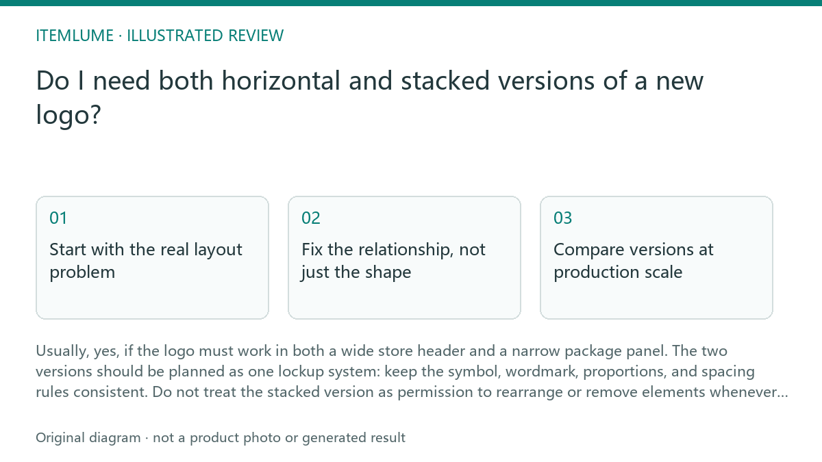
Usually, yes, if the logo must work in both a wide store header and a narrow package panel. The two versions should be planned as one lockup system: keep the symbol, wordmark, proportions, and spacing rules consistent. Do not treat the stacked version as permission to rearrange or remove elements whenever a layout feels difficult.
Start with the real layout problem
A symbol-plus-wordmark may read comfortably in a website header because the available width lets the symbol sit beside the name. On a narrow bottle label, that same arrangement may force the wordmark to become too small, wrap awkwardly, or compete with mandatory product information. The issue is usually layout pressure, not a failure of the logo concept.
Test the actual surfaces before choosing a second version. Use a realistic wide page header, a narrow label or pouch panel, and the smallest repeated use that matters, such as a cap, seal, or small online thumbnail. A second version is justified when the primary lockup repeatedly loses legibility or hierarchy in one of these contexts.
- Place the primary horizontal lockup in a realistic wide header and record the usable width.
- Place the same lockup on the narrowest important label or package panel at its intended size.
- Check symbol recognition, wordmark legibility, clear space, and nearby mandatory text.
- Approve a stacked version only if it solves the narrow layout without changing the identity.
Fix the relationship, not just the shape
A stacked version should define a deliberate relationship between symbol and wordmark: alignment, gap, scale ratio, and optical balance. For example, the symbol may sit above the wordmark with a controlled gap, while the wordmark remains intact and readable. The result should feel like the same logo system viewed in a different orientation.
Avoid arbitrary拆分 or decorative rearrangement. Do not remove letters, stretch the symbol, change the wordmark proportions, or create a new symbol simply because a package is narrow. If a long name still cannot fit, solve that separately with a supported lockup, a carefully approved abbreviation, or a different information hierarchy outside the master logo.
Compare versions at production scale
Review both versions at the size they will actually occupy, not only on a large presentation board. A stacked logo can look balanced when enlarged yet become dense when reduced. A horizontal logo can remain recognizable at small height but become too wide for a bottle shoulder or side panel.
Use one-color and reversed checks where the mark may appear on stamps, small labels, or photography. These checks are workflow tests, not proof that a production file is ready. Itemlume planning can help organize the concept and review scenes, but it does not publish the logo to stores, produce production vector logos or manufacturing-ready dielines, or prove fit or product performance.
Choose a system you can govern
Document which version is preferred, where the alternate version is allowed, and what must remain fixed. Include minimum display size, clear space, background rules, and whether the symbol may appear alone. This prevents teams from inventing unofficial combinations for every new surface.
Treat the horizontal and stacked versions as approved members of one identity system, not as two unrelated logos. If the brand name is long, the stacked option may improve packaging fit, but it does not remove the need to test reading order, accents, spacing, and the visual priority between the symbol and the full name.
Logo version diagnostic review
| Observation | Next check | Pass condition |
|---|---|---|
| Horizontal lockup fits a wide store header but feels cramped on a bottle label | Compare the same artwork with a controlled stacked arrangement at actual label width | The stacked version preserves the full wordmark and remains readable without crowding product text |
| Symbol is recognizable, but the wordmark becomes too small when the lockup is reduced | Test the narrowest required use and inspect letter shapes, accents, and spacing | Both symbol and wordmark meet the planned reading requirement, or the surface is assigned another approved treatment |
| Team members keep separating the symbol and letters in different ways | Create one approved stacked lockup and document clear space, alignment, and allowed uses | No unofficial rearrangement is needed to fit the tested surfaces |
| The stacked version looks balanced in a large mockup but dense at package size | Review one-color, reversed, and smallest-use versions at production scale | The mark keeps its hierarchy and does not merge with nearby label information |
Sources and further reading
Sources for this page were checked on . Platform rules can change; verify the current source before publishing. Prompt examples and workflow recommendations are Itemlume editorial guidance, not independently measured results.
Frequently asked questions
Can I use the symbol alone on a small package?
Only if the symbol-alone use is intentionally approved and the audience can identify the brand without the wordmark. Treat it as a separate governed use, not an automatic shortcut.
Should the stacked version use a shorter brand name?
Usually no. Keep the approved wordmark intact unless a separate abbreviation has been deliberately created, reviewed, and documented for that purpose.
Does a stacked logo guarantee packaging fit?
No. It can improve the logo’s layout options, but final fit still depends on the real label dimensions, nearby required content, production method, and an actual review at intended size.
BUILD FROM A PRODUCT YOU KNOW
Put this workflow into practice with your own product.
Explore the relevant tool first. AI copy and concept planning are free after sign-in. Image and video generation require available credits and the applicable account access.
Open Logo studio Check pricing and credits