 Itemlume
PRACTICAL ANSWER / Packaging studio
Why does the same packaging color look different on kraft and white board?
The substrate is part of the color system. Brown kraft can mute, warm, or darken a pastel green, while white board gives the same inks a brighter base. Compare physical proofs under defined conditions, confirm whether white ink or another base layer is used, and keep screen color as a planning reference rather than print evidence.
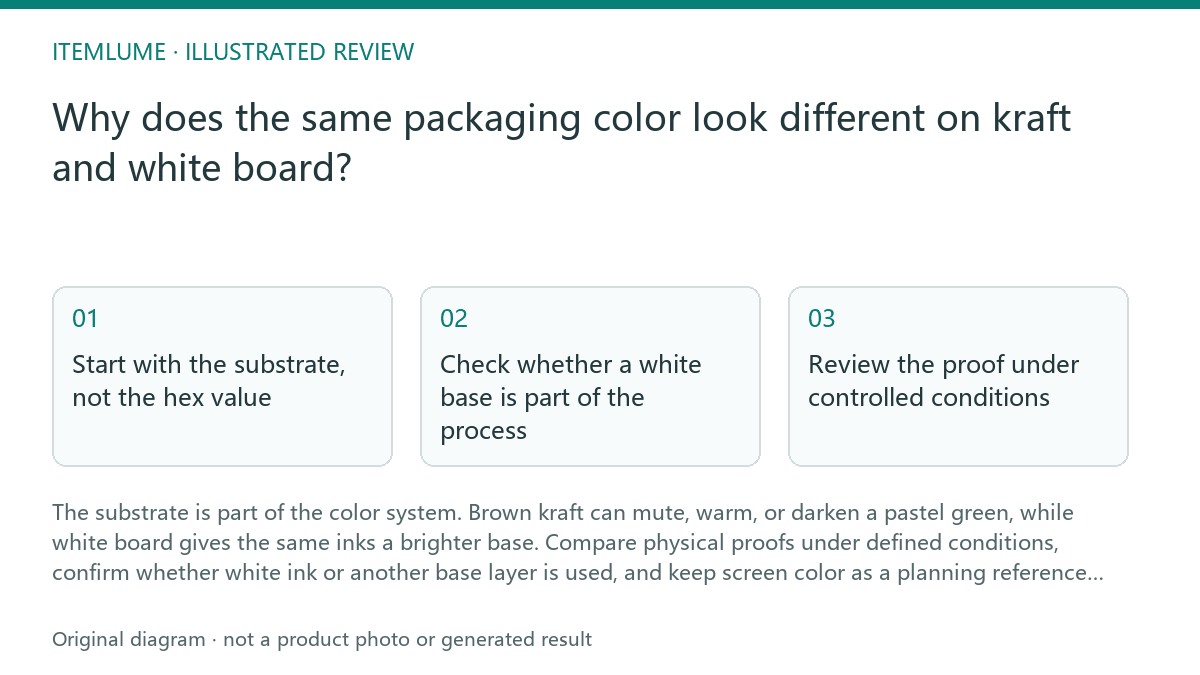
Start with the substrate, not the hex value
A screen mockup usually shows color against a clean digital white background. Kraft board already contains a visible brown tone, so printed ink is viewed through that base. A pastel green label may appear olive, gray-green, or less saturated on kraft even when the artwork file is identical. White board generally gives the color a lighter and more predictable starting point.
The comparison also changes with paper coating, absorbency, texture, and finish. Uncoated kraft can spread or soften small printed details, while a smoother white stock may hold edges and color density more clearly. Treat the substrate name, surface, and intended finish as part of the color brief. Do not describe the screen value as a guaranteed printed result.
Check whether a white base is part of the process
Some suppliers may use white ink, an opaque underprint, or another base treatment before the visible color. That can make a kraft result brighter, but it may also change opacity, edge behavior, registration risk, cost, and the appearance of unprinted areas. White ink is not an automatic correction; it is a production choice that must be confirmed with the supplier.
Ask which areas receive the base layer and whether the green is printed over it or directly onto kraft. A partial white base can create two versions of the same color on one label. Keep artwork layers or production notes clear enough to show intended white areas, but rely on the supplier's documented process for final feasibility and print approval.
- 1. Record the exact substrate, coating, texture, and finish for each version.
- 2. Ask whether white ink or another opaque base is used, and where.
- 3. Compare the same color patch on kraft and white board under the same light.
- 4. Review small text, edges, and unprinted areas for contrast changes.
- 5. Approve only after the physical comparison matches the intended use.
Review the proof under controlled conditions
A useful review separates color identity from visual context. Place the kraft and white-board samples side by side, remove unrelated colored objects, and use the lighting condition expected for the product or approval review. Photographing the samples can help document the decision, but a phone image is another screen interpretation, not a replacement for the physical sample.
For a fictional exercise, imagine a pastel green label planned at a screen reference of #A8D8A0. The kraft sample appears warmer and darker, while the white-board sample appears brighter. The correct question is not which sample matches the screen more closely. Ask which appearance is intended for the actual package, then confirm whether the supplier can reproduce that appearance consistently.
Separate design intent from print approval
The design file can define the intended color relationship between logo, product name, and supporting graphics. It cannot by itself prove how the ink will interact with kraft, how a white base will be registered, or how the finished surface will look after production. Keep those decisions visible in the brief instead of hiding them inside a screen mockup.
A practical approval record should identify the substrate version, finish, base-layer treatment, comparison lighting, and the physical reference accepted by the team. If the supplier changes stock, coating, or print method, reopen the color check. A previously accepted proof may no longer represent the new production combination.
Kraft-versus-white-board review
| Observation | Next check | Pass condition |
|---|---|---|
| Pastel green looks brownish or muted on kraft | Confirm substrate tone, absorbency, and whether a white base is used | The intended warmer or brighter appearance is documented and physically reviewed |
| The same color differs between printed areas on one label | Map which areas have white ink or another opaque underprint | Base-layer coverage is clear and the transition is acceptable |
| Small white or light text loses contrast on kraft | Inspect the smallest type and fine edges on the physical sample | Required information remains readable at the actual viewing distance |
| Supplier changes board or finish after approval | Restart the comparison using the new production combination | Approval names the current substrate, finish, and print process |
Sources and further reading
Sources for this page were checked on . Platform rules can change; verify the current source before publishing. Prompt examples and workflow recommendations are Itemlume editorial guidance, not independently measured results.
Frequently asked questions
Can I fix the kraft color by changing the screen hex value?
You can adjust the artwork as a planning step, but the printed result still depends on the substrate and supplier process. Use a physical comparison before approval.
Does white ink always make kraft packaging match white board?
No. It may brighten the printed area, but opacity, coverage, registration, finish, and unprinted regions can still create visible differences.
Is a screen mockup useful after I receive a printed proof?
Yes, as a record of design intent. It should not override the physical proof when judging the final substrate-specific appearance.
BUILD FROM A PRODUCT YOU KNOW
Put this workflow into practice with your own product.
Explore the relevant tool first. AI copy and concept planning are free after sign-in. Image and video generation require available credits and the applicable account access.
Open Packaging studio Check pricing and credits